
Role
UX/UI Design Intern
Tools
Figma, Illustrator, After Effects
Team
Bria Dues
Reed Pafford
Shruti Parasher
Arjun Taneja
Jared Tarantino
Skills
Animation, Prototyping, Design systems, Cross-functional team collaboration
.png)


To learn what access solutions are currently available on the market, we surveyed a total of 101 building owners and people who currently live in small apartment or condo buildings internally within Chamberlain Group, using a mix of Likert scale rating, multiple choice, and short response questions. Survey content can be found here.

We could see from the rating that the residents of small building complexes do not find their current access solution very convenient, and we wanted to understand why. We conducted 6 thirty-minute follow-up interviews with current residents of small building complexes, and 5 thirty-minute interviews with property owners/managers of small building complexes around Chicago.
Resident 1: "I have too many keys."
Resident 2: "I would like if I don't need to personally let in my visitors."
Resident 3: "Knowing who is at my door gives me an extra layer of security."
Resident 4: "I know almost all of my neighbors, and sometimes they help me with things in my apartment while I am away."
Property Manager 1: "You gotta be involved if you want things to run smoothly."
Property Manager 2: "I would ideally want a way to give access to maintenance without having to meet them personally."
Property Manager 3: "Managing is a lot of work."
Property Manager 4: "For a small building, any system is costly to get installed."
Face ID is not currently used by competitor products on the market To answer the question of "how to users feel about biometric data", we sent out a second survey to small building complex residents within Chamberlain internally and received 24 responses.

We researched 10 intercom and smart home access solutions across the current market space and found that the following products are our closest competitors. But there is no direct competitor aimed at our user group that is also a smart system.

We concluded that our market opportunity would have the following 3 goals based on everything we learned from user research and competitor analysis:

Utilizing what we learned during user research, competitor analysis, as well as the market opportunity identified above, my team and I agreed on the following design priorities:

My team and I constructed the following personas collaboratively after summarizing what we learned during the research phase. We aim to use the personas to capture the needs and pain points of our targeted small building complex stakeholders and to aide us with future design decision making.

.png)

After defining the user personas, we created the following storyboards to further outline the 3 stakeholders' current entry journey to help us have a clear picture of what screens we may need to design for.


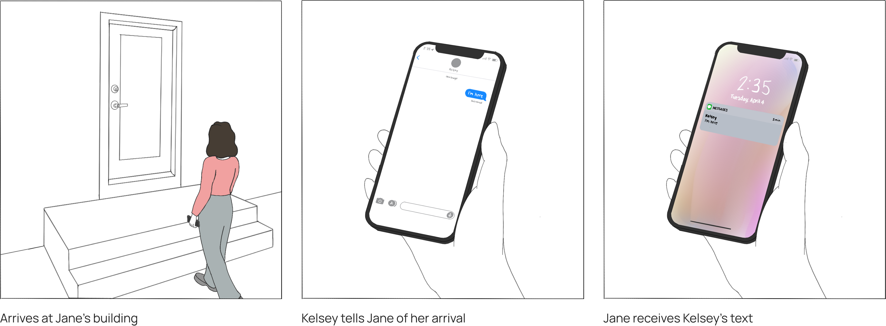

Drawing conclusions from both tenant and property. Our system should be able to do everything an intercom system does and more.
Face ID entry for residents: "I have too many keys."
QR code system for visitors: "I would like if I don't need to personally let my visitors in with my key."
Community and building management tools: "Knowing who's at my door gives me an extra layer of security."
One of the key challenges I faced when designing the interface for the Sentry intercom is balancing text readability and usability on such a small screen. This design experience encouraged me to think deeper about which functions/elements are necessary to each screen, and which ones are okay to leave out.
The Sentry intercom device is designed to be smaller than all of its market competitors and have simple mounting mechanisms, making it easy for small apartment building owners to install themselves. Through interviewing property owners, we found out that self-installation is the preferred method for most small apartment building owners.

After some card sorting activities, we learned that viewing directory and using QR code are the most straight forward guest entry method considering the number of residents in the building we are designing for.
While most competitor products use a search bar to connect with a building resident, we opted to not have that in order to prioritize readability.


We conducted usability testing by printing out paper copies of our intercom screen designs and placing them on the wall. We gathered feedback from 32 employees from Chamberlin Group internally with varying heights and age groups.
We received mixed reviews, some people said that they can see the screen clearly, while people who are on the shorter side said they could not read the texts very well, especially the description texts for "view directory" and "guest access" on the home page. But the general conclusion is: we need to make the texts bigger.

Taking feedback from usability testing, in the hi-fidelity design, we made the following key design decisions:

Taking feedback from usability testing, in the hi-fidelity design, we made the following key design decisions:

One of the key challenges I faced when designing the interface for the Sentry intercom is balancing text readability and usability on such a small screen. This design experience encouraged me to think deeper about which functions/elements are necessary to each screen, and which ones are okay to leave out.

Taking feedback from usability testing, in the hi-fidelity design, we made the following key design decisions:
Taking feedback from usability testing, in the hi-fidelity design, we made the following key design decisions:


Takeaway
Ideas or designs that at first seem redundant may not be so insubstantial after all and keeping track of iterations of ideas or designs is good practice. A scanning system for when item is ready was brought up in the first design meetings but did not seem fit in the wireframe. Usability testing proved that this feature might come in handy and it was later incorporated into the final design.
Another takeaway I have is that to improve usability, the design should match real world conventions. Usability testing participants were not sure where to proceed with the QR code screen because the page did not look clickable while it is — what doesn't look like a button shouldn't be a button.

Challenges
Coming up with the initial information architecture for the app was difficult and took more time than I expected. Initially, my team and I thought deciding on what and where to place labels and app components should be a simple process and thus did not budget enough time for designing information architecture.
We did not have a good picture on where to begin and when to stop. There were a lot of disagreements among the team for the layout of the home page. For future reference, card sorting could be useful for this aspect and speed up the process.
Technical Design
In order to sustain a large scale inventory management system, a secure and fast database must be used. For future implementation, I would use SQL to build the back-end of the app. The metadata schema for each inventory item can include: item name, unique ID, quantity in stock, and more. Each item must maintain its own use history, and the system overall must maintain a complete user list and error log.
Next Steps
Notification design will be the next step for this project. Ideally, astronauts should be able to receive notifications from both the iPad and from their current location. Apple Watches could be a fitting solution to address tis need. With more time, I want to design notification screens for iPad and potentially Apple watch as well.